
Last year, on the 3rd of April, I lay in excite as I bragged about a design update to whatever audience I had for my portfolio that went from 💩 to something that I would call an achievement that day.
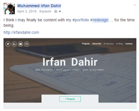
I went on about how content I was with it for the time being until about a week later the excite was replaced with a pit of angst within myself as I pondered on why everything looked so wrong.
Self-learning design has always been about observing it. Letting it sink in then having the option to replicate it. You have the tools. You know how to use them. But in the end, your mind is a blank slate.
And with that said, let’s get into a self-analysis of how I’ve taken it a step further over the year. Below you’ll witness a murder and the subjugator.
-

- Le Subjugator
-

- Le dieded
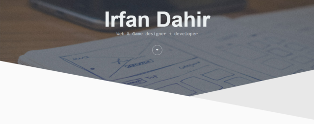
Now that you know, let us carry on with what was truly wrong with the former design. First of all.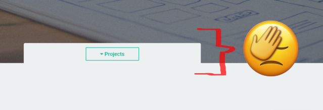
I don’t know what came into mind when I designed this but as far as I can recall, it looked good on paper. What I simply wanted to implement was a Call To Action button that would scroll the viewer down to my projects section.
The button looks like a drop down and that pop out make no sense.
It was late 2016 when I caught up with simple, yet effective SVGs (in detail here). My conclusion was that abrupt ends towards the end of sections, were simply too terrible, especially the way I was executing it. SVGs came along and filled in that gap.
With a much better looking CTA (but still not the best), I managed to compliment a ‘layered’ effect of different shades. Playing around with geometry transitions has always been a favorite.


Courtesy of my previous blog: https://bootyphpandi.wordpress.com/2015/10/27/the-beginning/
Unfortunately, I don’t have the files of my former design but those triangles slid in with a 45 degree rotation. The black and cyan-ish triangles you see there are simply squares that are hidden and partially shown on hover through that 45deg tilt. The black box tilted to the right where as the bottom, cyan box tilted upwards. This gave it this sleek look.
Back to the post.
There was one more shortcoming. (pun intended)
Siri courtesy: https://redd.it/5eht5c
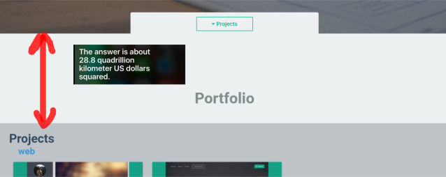
The job of the CTA was to scroll the user down 100 pixels to the designated section…
It was not until later, I realized that this was terrible and put some distance between it by bring the ‘about’ section before the portfolio. Talk about proper hierarchy.
The cringe
What you see below that paragraph of cringe is a bunch of icons of the ‘skillsets’ I have. Before this, I had bars that represented this, similar to my 2015 design:
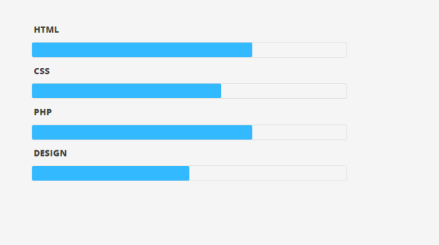
But the thing is, there’s no limits to these skills. Something new comes out every day and I was simply pulling out the experience percentage based on my then beliefs.
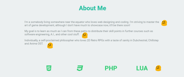
Instead, I’ve replaced it with something generic and descriptive. This goes below the about section.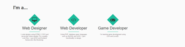
The simple “Biography”
Speaking of the about section, here’s how it looked before.
Talk about a cringeful, long description with font size big enough for sufficient for the elders only.
I’ve changed this entirely. It’s now the first section, so it’s right below the header.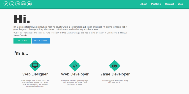
Pretty dank, aye?
Navigation, ahoy
Before we progress, there is one more thing we need to talk about and that’s the sticky navigation bar that follows you down.
Before I had this dull piece of stick 
And now, there’s this
The portfolio’s new design is supposed to have more contrast. As you may have noticed (or not), the height of the sticky nav bar is much smaller now. It adds more breathing space to the page by tens of pixels.
There’s also a little border at the bottom to make it ‘pop-out’ with a much more elaborate shadow at the bottom than the former.
Relevant Oatmeal
Work of ‘The Oatmeal’ (http://theoatmeal.com/comics/design_hell)
The Portfolio
Let’s talk about the portfolio section. Before it was boring cards with direct links to the download or view button and the cards themselves had some design issues. I don’t have a pre-existing screenshot but they looked like the ones now except the images got squeezed or stretched.
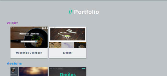
I’ve updated that part and divided the portfolio into 3 categories, Client, Designs & Apps.
Taking guess would be enough to realize that the client category is for client work, the design category is for web designs I make myself, be it free or premium. And Apps are app websites I’ve developed.
But that’s not the best part of the portfolio, you may see a familiar design on hover here lacking the download and view buttons. That’s because it’s begging to be clicked.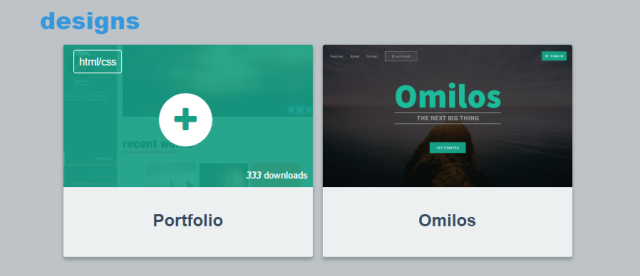 If it’s downloadable, a small download button appears as well. Now once you click on the card, it fetches the details for the item via AJAX and using Bootstrap Modals, we get this beauty.
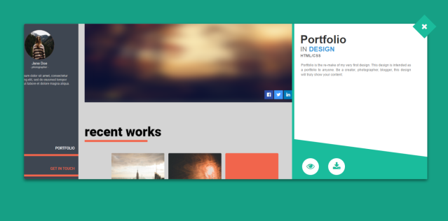
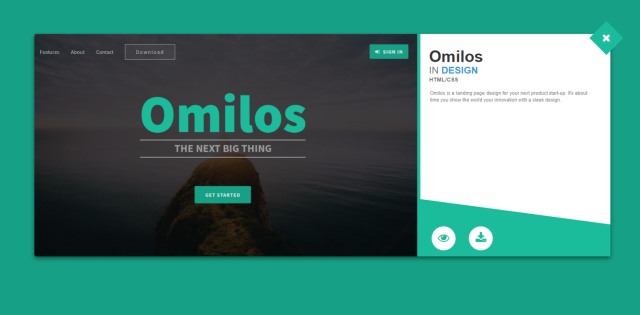
I can safely say that this is probably the first modal I’ve designed, hence some design issues here too. I need to rework the bottom part, not sure at the moment how though. But this is what I’ve got. It’s quick and simple. Bootstrap Modals are a bonus with User Experience. Click on the X or behind the modal and you’re back to the portfolio.
The Bottom
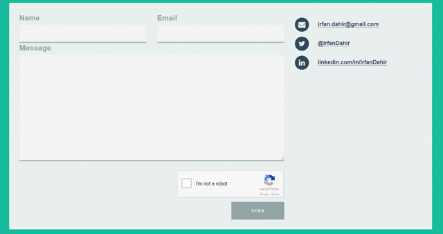
The contact section may look nearly identical to the former but rest assured it’s been revamped from a user experience perspective. Instead of the good old page reload for the submission process, it now utilizes the power of AJAX for a synchronous update on the spot. It’s acquainted with Sweet Alerts and Google’s reCAPTCHA which provides some mercy on the database.
There’s 860 messages of which 4 are actual messages and the rest of it are spam. My website is quite popular with the bots – heh.
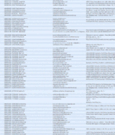
Messages from Bots
Nevertheless, here’s how fast and simple it is now for anyone to drop in a message.
As for the footer, I’ve removed the bulky useless section it had before and replaced it with something simple.

You may have realized, I removed the Twitter Feed! Actually, I had plans for it. Right now I’m using free hosting from 000webhost. It disallows the use of REST APIs and that sucks. I actually have the whole Twitter API, cache, etc ready to roll out. All it’s lacking is the design. I thought I’d put it in the footer but that’s just meh. I thought I should promote my blog posts on my portfolio as well so I’ve been thinking of making an entire new section dedicated to a twitter feed (“recent rambling”) and blog posts (“recent posts”). I haven’t designed anything yet as they both use REST APIs and until I move to a proper limitless domain, I won’t be updating on this.
Enough of the design, Let’s talk about the inside.
It’s what’s on the inside that counts.
I’ve re-coded everything in PHP, still not following the MVC structure but rather my own structure, which is truly odd to explain.
I’ve moved from using CSS to LESS. LESS is basically better CSS syntax. Next up, I’ve started using Bootstrap as the front end framework. As much as I promised to use only made-from-scratch stuff, I’ve really been slowing myself down. Bootstrap has built in modals, grids, etc which really put off workload. Both of these combined proved a faster and easier workflow. I’ve really cut in half the time it takes to code a design.
What now?
I’m still not content with how it looks. I’ve still yet to implement the section that consists of my blog and twitter posts. Also, the website lacks responsiveness (not adapted for mobile or tablets). I’m too lazy to add it now but I’ll probably ninja add it later on.
One more thing!
Branding. So far I’ve not used any logos to represent myself and really needed a favicon (that tiny icon you see on your tab before the web page’s title). So I followed my life motto, “Why not?”, and thus utilized my expert GIMP skills (2poor4photoshop) and came up with the following.
![]()
As you can see, it looks terrible at the edges, but that’s not going to show in a small logo or favicon and I’m too lazy to perfect the small details it at the moment. Maybe later on?
This concludes the berating of my former portfolio and what I did to upgrade it.
ayylmao
